Back to demo index

gnuplot demo script: boxplot.dem

autogenerated by webify.pl on Fri Dec 20 14:46:23 2024
gnuplot version gnuplot 6.0 patchlevel 2
#
# Boxplot demo
#

print "*** Boxplot demo ***"

set style fill solid 0.5 border -1
set style boxplot outliers pointtype 7
set style data boxplot
set boxwidth  0.5
set pointsize 0.5

unset key
set border 2
set xtics ("A" 1, "B" 2) scale 0.0
set xtics nomirror
set ytics nomirror
set yrange [0:100]
set jitter spread 0.5

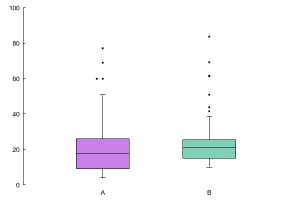
plot 'silver.dat' using (1):2, '' using (2):(5*$3)


Click here for minimal script to generate this plot


# Comparing sub-datasets

set xtics auto
set yrange [*:*]
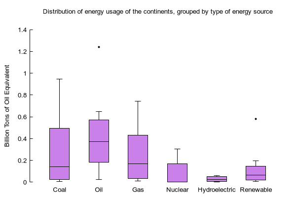
set title "Distribution of energy usage of the continents, grouped by type of energy source\n"
set ylabel "Billion Tons of Oil Equivalent"

plot 'energy_circles.dat' using (1):($8/1.e6):(0):4


Click here for minimal script to generate this plot


set linetype 51 lc "dark-red"
set linetype 52 lc "dark-red"
set linetype 53 lc "dark-red"
set linetype 54 lc "midnight-blue"
set linetype 55 lc "sea-green"
set linetype 56 lc "sea-green"
set linetype 57 lc "sea-green"

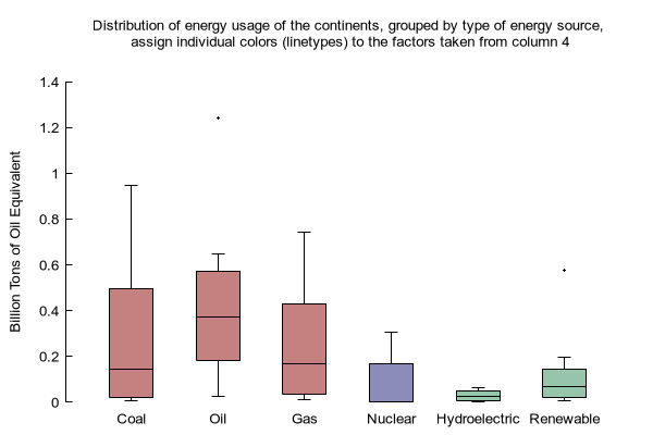
set title "Distribution of energy usage of the continents, grouped by type of energy source,\n assign individual colors (linetypes) to the factors taken from column 4\n"

plot 'energy_circles.dat' using (1):($8/1.e6):(0):4 lt 51 lc variable


Click here for minimal script to generate this plot


# Sort factors alphabetically

set style boxplot sorted

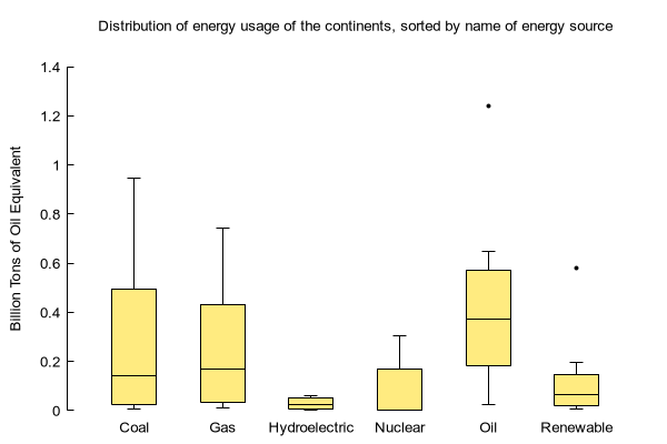
set title "Distribution of energy usage of the continents, sorted by name of energy source\n"

plot 'energy_circles.dat' using (1):($8/1.e6):(0):4 lc rgb "gold"


Click here for minimal script to generate this plot


# The same as above, with manual filtering
# Note that you have to specify the factors and you have to set the xtics as well.
# However, you have greater control over the appearance of the plot
# e.g. the order of the boxplots, their colors, the tic labels
# The previous form is intended for interactive usage while the latter form is better suited
# to creating publication-ready graphs.
# Note: we turn off autoscaling for the last two categories so that outliers do not
# expand the range on y even though they are not shown.

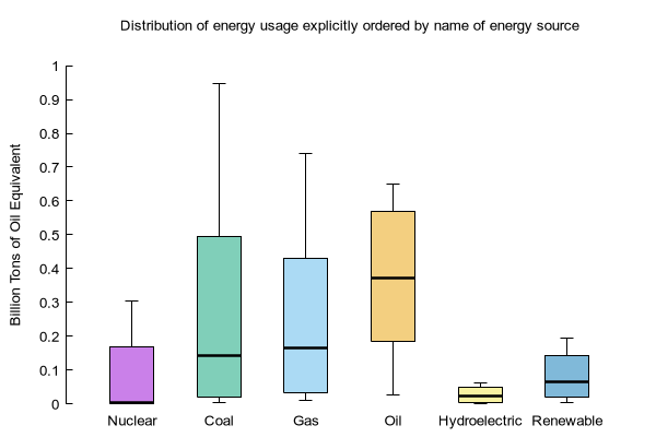
factors = "Nuclear Coal Gas Oil Hydroelectric Renewable"
NF = words(factors)
set xtic ("" 1)
set for [i=1:NF] xtics add (word(factors,i) i) 
set style boxplot nooutliers medianlinewidth 2.5

t(x) = x/1.e6
filter(col, factor_col, level) = (strcol(factor_col) eq word(factors, level)) ? t(column(col)) : 1/0

set title "Distribution of energy usage explicitly ordered by name of energy source\n"

plot for [i=1:NF-2]  'energy_circles.dat' using (i):(filter(8, 4, i)), \
     for [i=NF-1:NF] 'energy_circles.dat' using (i):(filter(8, 4, i)) noauto


Click here for minimal script to generate this plot


unset datafile